Introduction: Connecting Your Learning
 In the IT field, data are often collected about Web site visitors, how applications are being used, how system resources are utilized, and more. This data are often displayed in charts, tables, or graphs in order to produce a visual image that is helpful in interpreting the results.
From a graph or table, an observer is able to detect any patterns or trends that may exist.
For example, you might be able to easily identify times when a high amount of traffic occurs on your Web site. If this happens routinely, you can identify what is driving visitors to your Web site at those times and then try to expand upon that feature to gain more business. In this lesson, you will learn how to interpret data that is displayed in graphical form.
Focusing Your Learning
Lesson Objectives
By the end of this lesson, you should be able to:
- Interpret distributions of data using various types of graphs.
Key Terms
Review the flashcards to help you become familiar with the key terms for this lesson.
Presentation
What is a Statistical Graph?
A statistical graph is a tool that helps you learn about the shape or distribution of a data sample. The graph can be a more effective way of presenting data than a mass of numbers because you can see data clusters and areas where only a few data values occur. Newspapers and the Internet use graphs to show trends and to enable readers to compare facts and figures quickly.
Statisticians often graph data first to get a picture of the data. Then, more formal tools may be applied.
Many types of graphs are used to summarize and organize data. In this lesson, you will become familiar with a stemplot, a line graph, a bar graph, a chart, box and whisker plots, and a pie graph.
Stem and Leaf Graphs (Stemplots)
One simple graph, the stem-and-leaf graph or stemplot, comes from the field of exploratory data analysis. The stemplot is a quick way to graph and gives an exact picture of the data. It is a good choice when the data sets are small.
The leaf consists of a final significant digit. For example, the number 23 has stem 2 and leaf 3. The number 432 has stem 43 and leaf 2. The number 5,432 has stem 543 and leaf 2. The decimal 9.3 has stem 9 and leaf 3.
Example: Stem Plot
In Susan Dean's computer training class, scores for the first exam were as follows (smallest to largest):
33; 42; 49; 49; 53; 55; 55; 61; 63; 67; 68; 68; 69; 69; 72; 73; 74; 78; 80; 83; 88; 88; 88; 90; 92; 94; 94; 94; 94; 96; 100
| Stem | Leaf |
| 3 | 3 |
| 4 | 299 |
| 5 | 355 |
| 6 | 1378899 |
| 7 | 2348 |
| 8 | 03888 |
| 9 | 0244446 |
| 10 | 0 |
| Table 1: Stem-and-Leaf Diagram | |
The stemplot shows that most scores fell in the 60s, 70s, 80s, and 90s. Eight out of the 31 scores or approximately 26% of the scores were in the 90s or were 100, a fairly high number of As.
The stemplot is a quick way to graph and gives an exact picture of the data.
Line Graph
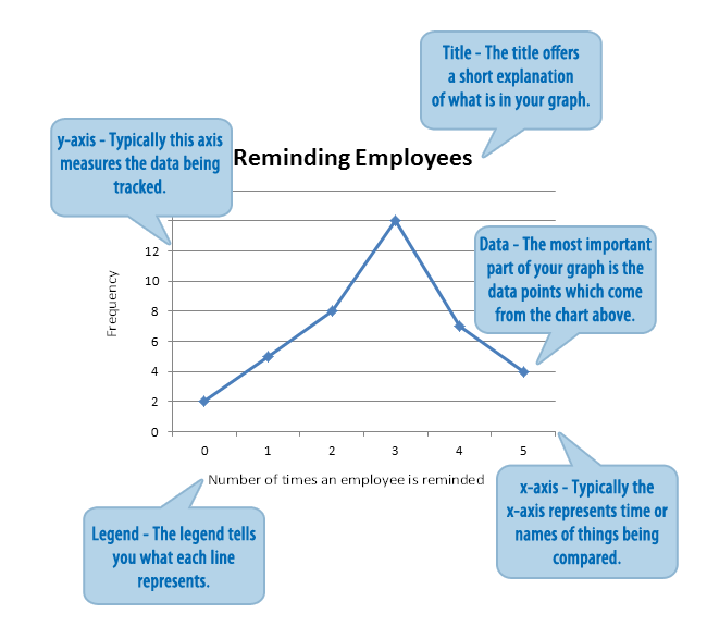
Another type of graph that is useful for showing specific data values is a line graph. In the line graph shown in the example, the x-axis consists of data values, and the y-axis consists of frequency points. The frequency points are connected.
Example: Line Graph
In a survey, 40 managers were asked how many times per week an employee must be reminded to do his/her weekly report. The results are shown in the table and the line graph.
| Number of times employee is reminded |
Frequency |
| 0 | 2 |
| 1 | 5 |
| 2 | 8 |
| 3 | 14 |
| 4 | 7 |
| 5 | 4 |
Bar Graphs
Bar graphs consist of bars that are separated from each other. The bars can be rectangles or rectangular boxes, and they can be vertical or horizontal. As with a line graph, the bar graph has a few key parts: the title, the legend, the x- and y-axes, and of course the data. The bar graph below shows the price comparison in dollars for various brands of computer monitors. Study the graph below then answer the following questions.
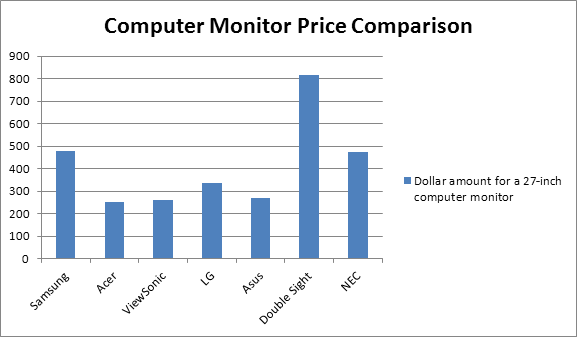
- Which brand is the least expensive?
- What size computer monitor is this graph referring to?
- What is the price difference between the Double Sight and the Samsung?
- Greater than $500
- Less than $150
- Between $150 and $250
- Between $300 and $400
- What would cost more: two LG computer monitors or one Double Sight computer monitor?
Charts
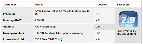
You often encounter charts of information. Charts are typically used when a graphical representation of the data is not sufficient. Below you will find performance information from two computers. Familiarize yourself with this information, answer the questions below, and then select the Check Answers link to see how well you did.
Practice Activity
Computer 1
Computer 2
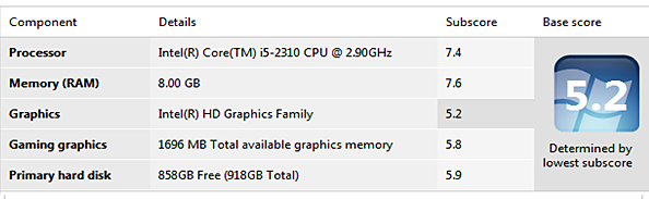
- In which category was the subscore the lowest for each of the computers?
- When comparing the gaming graphics category, how much more "total available graphics memory" does Computer 2 have?
- Which computer has the highest percentage of free space on the hard drive?
- When comparing the subscores within each computer, which computer has the greatest distance between the highest score and the lowest score?
Box and Whisker Plots (Box Plots)
Box plots or box-whisker plots provide a graphical image of the concentration of the data. They also show the how far the extreme values are from most of the data. The box plot is constructed from five values: the smallest value, the first quartile, the median, the third quartile, and the largest value.
The median is a way of measuring the "center" of the data. You can think of the median as the "middle value," although it does not actually have to be one of the observed values. It is a number that separates ordered data into halves. Half the values are the same number or smaller than the median, and half the values are the same number or larger. Take a look at the example below.
Example
Consider the following data:
1; 11.5; 6; 7.2; 4; 8; 9; 10; 6.8; 8.3; 2; 2; 10; 1
Ordered from smallest to largest:
1; 1; 2; 2; 4; 6; 6.8; 7.2; 8; 8.3; 9; 10; 10; 11.5
The median is between the seventh value: 6.8, and the eighth value: 7.2. To find the median, add the two values together and divide by 2.

The median is 7. Half of the values are smaller than 7, and half of the values are larger than 7.
Quartiles are numbers that separate the data into quarters. Quartiles may or may not be part of the data. To find the quartiles, first find the median or second quartile. The first quartile is the middle value of the lower half of the data, and the third quartile is the middle value of the upper half of the data. To get the idea, consider the same data set shown above:
1; 1; 2; 2; 4; 6; 6.8; 7.2; 8; 8.3; 9; 10; 10; 11.5
The median or second quartile is 7. The lower half of the data is the set 1, 1, 2, 2, 4, 6, 6.8. The middle value of the lower half is 2.
1; 1; 2; 2; 4; 6; 6.8
The number 2, which is part of the data, is the first quartile. One-fourth of the values are the same or less than 2, and three-fourths of the values are more than 2.
The upper half of the data is the set 7.2, 8, 8.3, 9, 10, 10, 11.5. The middle value of the upper half is 9.
7.2; 8; 8.3; 9; 10; 10; 11.5
The number 9, which is part of the data, is the third quartile. Three-fourths of the values are less than 9, and one-fourth of the values are more than 9.
Pie Charts
Pie charts, or circle graphs, are used extensively in statistics. These graphs appear often in newspapers and magazines. A pie chart shows the relationship of the parts to the whole by visually comparing the sizes of the sections (slices).
Below is a screen shot of the C: Drive properties for a computer. The circle graph below shows the free and used space for this computer.
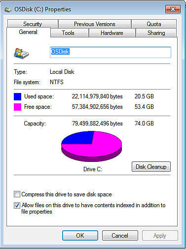
Practice
Now that you have reviewed the screen shot of the C: Drive properties, answer the following questions.
- What percentage of this computer's C: Drive capacity is being used? (round your answer to the nearest percent)
- What percentage of this computer's C: Drive capacity is free space? (round your answer to the nearest percent)
- How many more bytes of memory does the free space category have than the used space category?
- After a family vacation Jeff decides to download pictures onto the computer shown above. If he downloads 13,111,876,532 bytes of information, how much free space will remain?
- A total of 3% of the used space is taken up by advertisements placed on the computer by the manufacturer. How many GB of information is taken up by advertisements?
Now that you have added to your knowledge by reviewing the lesson and the examples, it is time to watch the following Khan Academy videos. These videos will provide additional explanations and working examples to help you better understand the concepts of this lesson.
 | Math Video Toolkit: |
Practice
 |
Now you get a chance to work out some problems. Select the following link to complete the practice activity. |
Summarizing Your Learning
In this lesson you learned that a graph is simply an illustration of data that allows the viewer to quickly obtain information about trends and comparisons. Information in a graph can help you analyze data to make informed decisions.
Assessing Your Learning
 |
Now that you have read over the lesson carefully and attempted the practice problems, it is time to complete a knowledge check. Please note that this is a graded part of this lesson so be sure you have prepared yourself before starting. |
1) Complete the Statistics: Working with Graphs.
Resources:
“Chapter 7: Organizing and Displaying Distributions of Data” by Merry, B. © 2012 was retrieved from http://www.ck12.org/flexbook/chapter/9142 and used under a Creative Commons Attribution http://creativecommons.org/licenses/by/3.0/. The presentation section is an adaption of the lesson titled, “Graphs: Interpreting Data,”by the National Information Security and Geospatial Technologies Consortium (NISGTC) is licensed under the Creative Commons Attribution 3.0 Unported License. To view a copy of this license, visit http://creativecommons.org/licenses/by/3.0
“Descriptive Statistics: Stem and Leaf Graphs (Stemplots), Line Graphs and Bar Graphs” by Dean, S., & Illowsky, B. © 2012 was retrieved from http://cnx.org/content/m16849/1.15 and used under a Creative Commons Attribution http://creativecommons.org/licenses/by/3.0/. The presentation segment is an adaption of the lesson titled, “Graphs: Interpreting Data,”by the National Information Security and Geospatial Technologies Consortium (NISGTC) is licensed under the Creative Commons Attribution 3.0 Unported License. To view a copy of this license, visit http://creativecommons.org/licenses/by/3.0