Introduction
The User Interface (UI) of Windows Store apps written in either Visual Basic (VB) or C# is composed of pages defined by XAML (Extensible Application Markup Language). We saw the basics of creating XAML pages in the previous lesson. Defining XAML interfaces is the first primary difference in creating Windows Store apps verses the traditional desktop applications development. In this lesson, we will explore the various XAML controls in more depth along with their most significant attributes or properties. We will also look at how to utilize themes and standard styles, and create new styles.
- Explain the use of popular XAML elements for content display and interaction.
- Utilize standard styles in user interface creation.
- Create and use a new style.
- Creating the XAML Interface
- Examining XAML Controls (Part 1)
- Creating and Applying Styles
- Explore the "Windows.UI.Xaml.Controls classes" from the Windows Dev Center – Windows Store Apps website for online help with XAML controls for Windows 8. Click on links at the left for the various controls discussed in Lesson 4, such as Button, Frame, Page, Grid, TextBlock, RichTextBlock, RichTextBlockOverflow, RichEditBox, TextBox, PasswordBox, Image, RadioButton, CheckBox, ToggleSwitch, and ToggleButtons.
- Quiz 4
- Assignment 4A (Chessboard)
- Assignment 4B (Lions, Tigers, and Bears)
Instruction
(Note: Due to the formatting limitations of this document, some code snippets presented here may include statements split on more than one line when in the code editor they should not be. E.g. literal strings (red text enclosed in quotes) must occur on one line. Make the appropriate corrections in the Visual Studio text editor.)
The User Interface of a c# or Visual Basic Windows Store app is comprised of pages defined by XAML (Extensible Application Markup Language) tags much like a website is comprised of pages defined by HTML (HyperText Markup Language) tags. In this lesson, we will examine the principle XAML elements and their attributes. We look at how to navigate between pages, use styles to define the look of elements, including creating custom styles, and conclude with adding an App bar to a project.
Creating the XAML Interface
The XAML Code Editor
Review the "XAML Code Editor" section in the Lesson 4 Guide for detailed information and examples.
The XAML Designer Panel and XAML Toolbox
Element instances can also be created by dragging XAML elements from the Toolbox to the Designer panel. The code for the element is added to the underlying XAML document. Attribute settings for the selected element are displayed in the Properties panel.
As changes are made to the XAML code, the Designer immediately reflects the effects of adding controls or changing element properties. However, on some occasions, especially with spacing issues, it is advisable to test the application in the simulator or on a device to verify that controls look and feel as they are intended. Most developers prefer writing XAML code to using the visual Designer panel.
Setting Attributes in the Properties Panel
In addition to setting properties for a control in the XAML code as attributes, properties may also be chosen for a control in the Properties panel as done previously for traditional desktop applications. As changes are made in the Properties panel, the XAML code is modified to reflect the choices.
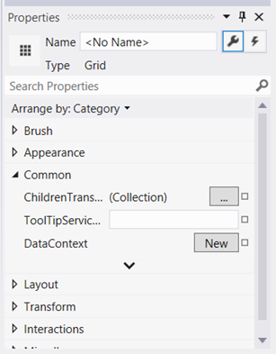
Figure 1 – The Properties Panel can be used to alter the attributes of the controls defined in the XAML code.
Pages
Just as you could navigate between multiple frames in a desktop application, Windows Store apps allow you to navigate between multiple pages. You can add several types of pages, depending on which option is best suited to your needs. The options include the following:
- Blank Page
- Basic Page
- Grouped Items Page
- Group Detail Page
- Item Detail Page
- Items Page
- Split Page
Review the "Pages" section in the Lesson 4 Guide for detailed information and examples.
Examining XAML Controls (Part 1)
Just as there were many more controls in developing traditional desktop applications than a developer uses in a typical application, the same is true in creating Windows Store apps. This lesson introduces you to primary controls used frequently for input, output, and basic content display.
Information on other controls is available from the online Microsoft Developer Network (MSDN) documentation. You can also refer to third-party reference books, websites, or online videos.
In Lesson Five, you will examine more of the container controls, such as StackPanels, ListViews, WrapGrids, FlipViews, and ViewBoxes.
Grid
Most apps utilize a grid for laying out the interface. In choosing a Blank App (XAML) project template, the app in Lesson 3 began with the MainPage as a Blank page. But in reality, it had an element– the Grid element. The Grid can scale to various devices and makes it possible to create rows and columns of specific or relative sizes. Grids are often nested inside other grids to create very flexible layouts.
Review the "Grid" section in the Lesson 4 Guide for detailed information and examples.
Text Controls – Overview
There are six primary controls for displaying text. The TextBlock, RichTextBlock and RichTextBlockOverflow controls are static controls for displaying read-only values. The display may be altered dynamically via code, but the user cannot modify the contents directly. The TextBlock operates on strings, while the other two utilize blocks of text. The names are confusing, because the text displayed in a TextBlock may be formatted in much the same style as one might associate with Rich Text Format (RTF) using runs and spans (similar to HTML code). The remaining three text controls are the TextBox, RichEditBox, and PasswordBox. These controls are for gathering user input.
Review the "Text Controls – Overview" section in the Lesson 4 Guide for detailed information and examples of the six controls for displaying text.
Image Control
The Image control is used for displaying bitmap images. In Lesson Two, you learned that it is advantageous to have three different sizes of an image (at 100%, 140%, and 180%) to achieve the best scaling on devices of differing resolutions. Images can be named using the following conventions:
- imageName.Scale-100.png (for device that have a height resolution of 768 or 800 pixels)
- imageName.Scale-140.png (for device that have a height resolution of 1080 pixels)
- imageName.Scale-180.png (for device that have a height resolution of 1440 pixels)
The source of the image in the XAML code (or the C# or VB code) is referred to as imageName.png. Choose the best resolution for the pertinent device.
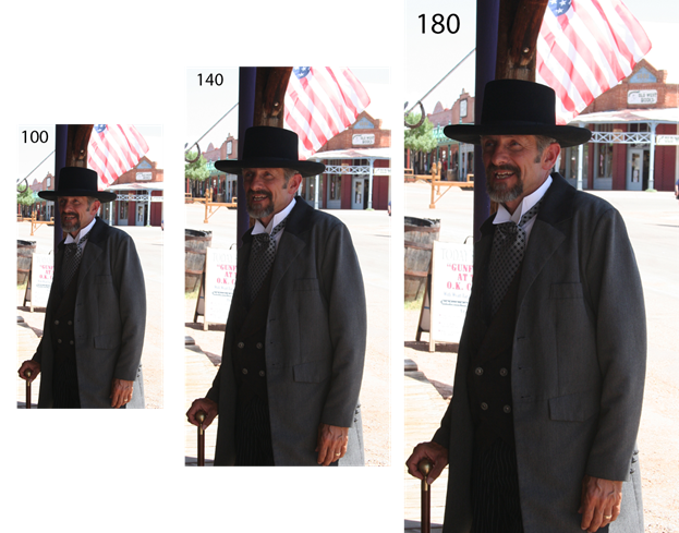
Figure 2 – The image of Doc Holliday is saved at three different resolutions: 396x768, 557x1080, and 743x1440.
TIP: Bitmaps should be scaled down rather than up. Accordingly, start with the largest resolution first (the 180 version), and then scale down to save the 140 version, and scale down even more to create the 100 version. Many professionals use Photoshop for this task, but other bitmap imaging software will work as well.
Review the "Image Control" section in the Lesson 4 Guide for detailed information and examples.
Buttons
Buttons work as they did in Windows desktop applications. One principle difference is that the caption of the button is displayed via the Context attribute rather than Text.
Review the "Buttons" section in the Lesson 4 Guide for detailed information and examples.
RadioButtons
RadioButtons are mutually exclusive within a grid or panel container and function the same as RadioButtons in Windows desktop applications. As with Buttons, the caption of the RadioButton is the Content property.
Review the "RadioButtons" section in the Lesson 4 Guide for detailed information and examples.
CheckBoxes
Similar to how RadioButtons function, checkboxes work as their desktop application counterparts. They are not mutually exclusive and the user may make multiple selections.
Review the "CheckBoxes" section in the Lesson 4 Guide for detailed information and examples.
ToggleSwitches
In the previous CheckBox section, you saw that checkboxes were used to toggle the display of images. For that app, a ToggleSwitch control could be an appropriate choice instead of the CheckBoxes. The user interacts with the Toggle switch by dragging the switch to the on (right) or off (left) position. Key Properties for the ToggleSwitch are the OffContent and OnContent attributes to display the current state of the Switch. These are "Off" and "On" by default, but may be customized to other options, such as "Hidden" and "Shown". The Toggled event is the most likely event to handle, using a conditional structure to handle the IsOn state (Boolean value).
Review the "ToggleSwitches" section in the Lesson 4 Guide for detailed information and examples.
ToggleButtons
A third option for displaying the various facial graffiti in the previous project is to use ToggleButton controls. ToggleButtons are push buttons that are highlighted when turned on (checked). The Tapped event can be handled and the IsChecked property evaluated in a conditional structure.
Review the "ToggleButtons" section in the Lesson 4 Guide for detailed information and examples.
Creating and Applying Styles
Previously, you set the look and feel of controls using the Properties panel or by adding style attributes such as FontSize, Fill, Background, or Border to the XAML code. Both procedures create styles that are considered Inline styles. Inline styles are set in the XAML code for individual controls. You may have copied and pasted a control and noticed that the attributes are copy and pasted as well, so you can maintain uniformity and consistency in the design.
Styles can also be set implicitly for specific control types or explicitly using named styles. Implicit styles might set all buttons to have a specific size, font, and fill color. Styles can also include VisualStates, or how the format of a button appears in various interactive states. Examples include "Normal", "Pressed", "PointerOver", or "Disabled".
Standard Styles
By default, new projects have a style reference that includes available, predefined styles in a document named StandardStyles.XAML in the Common folder. To better understand the StandardStyles.XAML document, you will begin by looking at the opening comment of the StandardStyles.XAML file:
<!--
This file contains XAML styles that simplify application development.
These are not merely convenient, but are required by most Visual Studio project and item templates removing, renaming, or otherwise modifying the content of these files may result in a project that does not build or that will not build once additional pages are added. If variations on these styles are desired, it is recommended that you copy the content under a new name and modify your private copy.
-->
Proceed with caution when making changes to the standard styles. You will notice that all styles are part of the <ResourceDictionary>. This dictionary contains ThemeDictionaries and Styles. The ThemeDictionaries by default reference which glyph to use for the Back Button – a default value, or one of high contrast on high-resolution devices.
For now, you can focus on styles. The first style you come across is RichTextBlock styles:
<!-- RichTextBlock styles -->
<Style x:Key="BasicRichTextStyle" TargetType="RichTextBlock">
<Setter Property="Foreground"
Value="{StaticResource ApplicationForegroundThemeBrush}"/>
<Setter Property="FontSize"
Value="{StaticResource ControlContentThemeFontSize}"/>
<Setter Property="FontFamily"
Value="{StaticResource ContentControlThemeFontFamily}"/>
<Setter Property="TextTrimming" Value="WordEllipsis"/>
<Setter Property="TextWrapping" Value="Wrap"/>
<Setter Property="Typography.StylisticSet20" Value="True"/>
<Setter Property="Typography.DiscretionaryLigatures" Value="True"/>
<Setter Property="Typography.CaseSensitiveForms" Value="True"/>
</Style>
The style in this case is an explicit style aimed at RichTextBlock controls. You can tell that it is named because it has a x:Key value. To apply this to a control, you must do so explicitly by referencing its name in the XAML code for the control (note the reference is preceded by its declaration as a StaticResource and enclosed in brackets):
<RichTextBlock HorizontalAlignment="Left" Height="188" Margin="162,95,0,0"
VerticalAlignment="Top" Width="419"
Style="{StaticResource BasicRichTextStyle}"><Paragraph>Four score and seven years ago, our fathers brought forth on this continent, a new nation, conceived in liberty.</Paragraph>
</RichTextBlock>
If you were to change the "Foreground" property in the Style to Red in the StandardStyles.xaml page, the text of the RichTextBlock would display in red.
<!-- RichTextBlock styles -->
<Style x:Key="BasicRichTextStyle" TargetType="RichTextBlock">
<Setter Property="Foreground" Value="Red"/>
<Setter Property="FontSize" . . .
It is not recommended to change styles in StandardsStyles.xaml. Instead, it is best to create your own custom styles in another document.
If you continue scrolling through the StandardStyles, you will encounter many different styles aimed at TextBlocks. Their names provide clues as to when they should be referenced for titles, headers, subheaders, items, captions, and so on.
Next are button styles. One thing you will notice with button styles is that here are different styles for various view states, such as "PointerOver", "Pressed", and "Disabled". When this style is applied, the view of the button automatically changes when someone interacts with the button.
Continue scrolling to the AppBarButton styles section. Here, you will find several styles commented out for the different standards glyphs that are useful for App Bar buttons. Uncomment any that you which to use. For more information on the glyphs, read "AppBar button style images" from the Windows Dev Center – Windows Store Apps website.
Creating New Styles
For most projects, you may want to create your own styles. Right-click on the Assets folder in the Solution Explorer. Choose Add > New Item. In the resulting dialog, click the Resource Dictionary entry and give it a name.
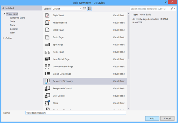
Figure 3 – To add a new styles dictionary, click on a folder such as Assets in the Solution Explorer. Choose Add > New Item. In the dialog depicted there, select Resource Dictionary, and give the new XAML page a name.
Implicit Styles
Open up the new styles dictionary to begin creating an implicit style. Implicit styles do not contain a key name, but rather reference a target control type via the TargetType attribute.
Review the "Implicit Styles" section in the Lesson 4 Guide for detailed information and examples.
Explicit Styles
While implicit styles are applied to any object of the specified type, explicit styles are named using an x:Key pair.
Review the "Explicit Styles" section in the Lesson 4 Guide for detailed information and examples.
Binding Attributes
Attribute values also can be bound to the elements of other controls. Inside the value portion of a value-pair, utilize the format of "{Binding ElementName=myElement, Path=myValue}". In this format, myElement is a reference to a named control (via x:Name) and myValue is a reference to one of its attributes or properties. This allows controls to change attribute values as their bound control changes. Experimenting with different attributes to get the right look and feel, or altering linked controls via code, can help save time.
For example in the following XAML code, the Background of the second button is linked to the Background of the first button.
<Button x:Name ="btnOne" Content="Button One" HorizontalAlignment="Left"
Margin="876,146,0,0" Grid.Row="2" VerticalAlignment="Top"
Background="Orange" Height="70" Width="169"/>
<Button x:Name ="btnTwo" Content="Button Two" HorizontalAlignment="Left"
Margin="876,256,0,0" Grid.Row="2" VerticalAlignment="Top"
Background="{Binding ElementName=btnOne, Path=Background}"
Height="70" Width="169"/>
Practice
Create an app that calculates the miles per gallon for user-entered values of the number of miles driven and the number of gallons used. Format the output to one decimal. The gas-pump image in this example is in the public domain. You can find the "Gas pump large BW" image on the WPClipart website.
Add a new resource dictionary and create the following four new styles:
| Style Name | Target | Properties |
|---|---|---|
| Implicit style | TextBlock | FontFace-SegoeUI FontSize=32 TextAlignment=Right Foreground=Wheat TextWrapping=NoWrap |
| TextBoxInputNumeric | TextBox | FontFace-SegoeUI FontSize=32 FontWeight=Bold TextAlignment=Right Background=Olive Foreground=White TextWrapping=NoWrap BorderThickness=4 |
| TextboxOutput | TextBox | FontFace-SegoeUI FontSize=32 FontWeight=Bold TextAlignment=Right Background=Black Foreground=Olive TextWrapping=NoWrap BorderThickness=4 |
| Button1 | Button | FontFace-SegoeUI FontSize=32 FontWeight=Bold Background=Olive Foreground=Black |
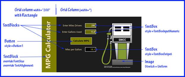
Figure 4 – The MPG Calculator interface storyboard.
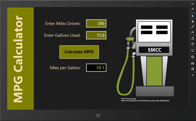
Figure 5 – The final MPG Calculator app.
Assignments
Complete the following:
- Quiz 4
- Assignment 4A (Chessboard)
- Assignment 4B (Lions, Tigers, and Bears)
Summary
Windows Store apps derive their user interface from one or more XAML pages featuring XAML control instances. The attributes of each instance may be modified in the XAML code directly or by using the Properties panel for the selected instance. Static text is displayed via TextBlock, RichTextBlock, and RichTextBockOverflow controls. The contents of these controls maybe modified via the underlying C# or VB code in response to user events. User input may be gathered via TextBox, RichEditBox, and PasswordBox controls.
Bitmap images are displayed in Image controls. The Stretch property determines how the image conforms to the control's boundaries. Bitmap images may be loaded from a local source, the Internet, or embedded into the project as resources. For best results, images can be provided at 100%, 140%, and 180% resolutions with the app loading the appropriate size for the given device.
Button controls are a popular UI object for user interaction and function much as they did in desktop applications. The Tapped event is their primary event. RadioButton controls are mutually exclusive, while CheckBox controls are not. Other interactive controls include the ToggleSwitch control and the ToggleButton control, both of which allow the user to toggle between two values or settings.
Styles allow you to predefine formatting of instances. Properties within a style are set using <Setter> elements and may include handling different view states. A set of standard styles are provided in the StandardStyle.xaml file. Implicit styles do not contain a key name and are automatically applied to all instances of a specified target type, such as all Buttons. Explicit Styles contain key names and are applied directly to instances by setting their Style property. Custom styles may be created, and it is recommended this is done in new ResourceDictionary XAML documents.

This work is created by the National Information Security and Geospatial Technologies Consortium (NISGTC), and except where otherwise noted, is licensed under the Creative Commons Attribution 3.0 Unported License